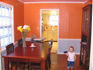
I've been considering the color scheme for about two months; I found the idea in the premier issue of this magazine and ever since have been trying to decide if it could work in our dining room. Prepare yourself...it's pretty different. The horizontal shot (complete with fuzzy Margot):
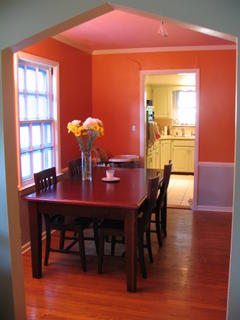
 And the vertical shot, so you can get a better look at the pink ceiling.
 No, you don't need adjust the color on your screen...the ceiling is pink, above the chair rail is orange and below the chair rail is a light gray. We're not quite sure what we think. It's definitely pretty close to the photo in the magazine, but we think the orange is too bright...too bold...to orange. We bought 2 other test oranges before committing to this one (because we were pretty sure and didn't want to buy ANOTHER tester). The first orange (Osage Orange) was too bright/intense...it looked like a highlighter. The second orange (Kumquat) looked like a pale, rusty brown on the swatch, but was also a bright orange on the wall. We thought a darker orange (Marquis Orange) might tone down the brightness. I think we were wrong. We ended up with a bright, BOLD orange. Honestly, we don't have the energy to even think about repainting it now being that we spent two entire days priming, taping, painting trim and walls -- all while trying to keep Margot out of the room. We're going to see how we feel about it in a week or two. In the meantime, if you want to appear as if you have a great tan (or sunburn, depending on how you look at it), come over to our house for dinner.
Side note: We forgot to take a before photo, but for those of you who want to envision where we came from, picture brown trim, cream above the chair rail and red wallpaper with pineapples below the chair rail. Definitely not our style.
7 comments:
wow!!!! and the sparkly popcorn is gone too? holy smokes, i cant wait to see it in person. is margot getting a tan in that picture?? im liking the boldness! way to go guys!
it looks better in the photos
i think it looks great! the photo really looks just like the one in the magazine you showed me! way to step out of the box! it seems so much better than the all white walls that we have! and we would love for you to come to columbia & have some sparky's whenever you get a chance!
way to go McClains! can't wait to see it in person. our entire apartment is cream w/ white trim, boring!!
We also used the weekend to do some painting - in fact I am still wearing a little - but we went with Cup of cocoa, a little less bold, but also a little safer since we were re-doing our bedroom. orange may be a little much to wake up to, but i think by the time you got to breakfast it would be fun. also count me on the list for sparkly popcorn nostalgia!
Wow. You are brave, and I like it.
kristen i love the color- it looks great with your table and hutch!
Post a Comment